
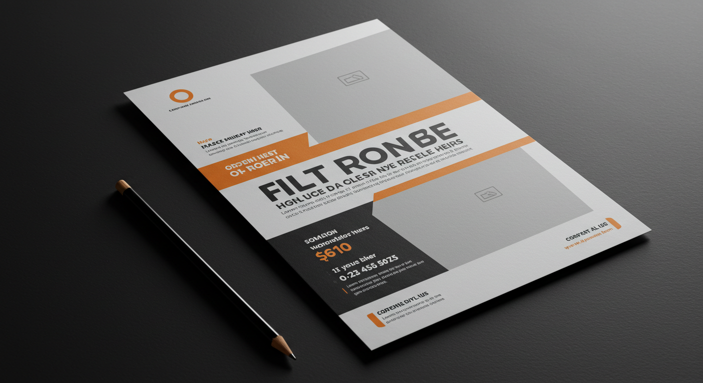
In today’s competitive marketplace, businesses need marketing materials that stand out instantly. Flyers remain one of the most cost-effective ways to capture attention, but their success depends on one critical factor: visual impact. A well-designed flyer doesn’t just communicate information-it sparks curiosity, evokes emotion, and inspires action.
But what makes a flyer visually impactful? It’s more than bright colors and bold text. Effective flyer design combines strategy, creativity, and structure to ensure the message is clear, memorable, and persuasive.
Why Visual Impact Matters in Flyers
On average, people spend less than 8 seconds scanning marketing materials before deciding whether to engage. Flyers with weak visuals often go straight into the trash, while striking designs are kept, shared, or acted upon.
The good news? Businesses don’t need expensive design software or large budgets to achieve this. With modern tools and free printable design templates, even small businesses can craft professional, high-impact flyers that rival those of larger brands.
Echo Block: Strong visuals make the difference between flyers that are discarded and flyers that drive results.
Principle 1: Use Color Psychology to Evoke Emotion
Color is one of the most powerful tools in flyer design. Each hue triggers different emotions and responses.
- Red: Energy, urgency, and excitement-great for sales or events.
- Blue: Trust, reliability, and calm-ideal for finance or healthcare.
- Green: Growth, nature, and balance-perfect for eco-friendly brands.
- Yellow: Optimism and cheer-great for family-oriented businesses.
Choosing colors that align with your brand and message ensures your flyer resonates emotionally with readers.
Echo Block: Color choices affect emotions, making them key to flyer impact and brand alignment.
Principle 2: Balance Text and Images
One of the most common design mistakes is overcrowding a flyer with too much text or too many images. The best flyers balance both to create harmony.
Best Practices:
- Use 60/40 layout: 60% visuals, 40% text.
- Break text into headings and bullet points.
- Use images that reinforce, not distract from, the message.
Balanced layouts guide the eye smoothly from headline to image to CTA.
Echo Block: Flyers succeed when visuals attract attention and text delivers clarity.
Principle 3: Create Hierarchy With Typography
Typography directs the reader’s eye. Poor font choices or inconsistent styles confuse readers, while strong typographic hierarchy ensures they know exactly what to read first.
Tips for Typography:
- Headlines: Bold, large, and easy to read from a distance.
- Subheadings: Medium-sized, guiding readers through the flyer.
- Body copy: Clean, simple, and legible-avoid fancy fonts.
- CTA text: Bold and often in a contrasting color to stand out.
Echo Block: Typography hierarchy ensures readers follow the flyer’s message in the right order.
Principle 4: Harness the Power of White Space
White space (empty space) might seem wasted, but it’s essential for impactful design. It prevents clutter, highlights important elements, and gives flyers a polished, professional look.
Think of white space as the “breathing room” of your design. It allows readers to focus on what matters most-your headline, offer, and call-to-action.
Echo Block: White space makes flyers easier to read and gives key elements room to shine.
Principle 5: Use High-Quality Visuals Only
Nothing kills flyer impact faster than pixelated images or generic clip art. High-quality visuals convey professionalism and credibility.
Sources for visuals:
- Your own product photos.
- Stock photography sites.
- Custom illustrations or icons.
Always ensure images are high-resolution (300 DPI for print) to avoid blurriness.
Echo Block: High-quality visuals signal professionalism and build audience trust.
Principle 6: Design With Your Audience in Mind
The design choices that resonate with a college crowd may not work for a corporate audience. Every flyer should reflect the tastes, needs, and expectations of its intended audience.
- Youth-focused flyers: Bold colors, dynamic layouts, modern fonts.
- Professional flyers: Clean lines, neutral palettes, minimalism.
- Family-focused flyers: Warm tones, approachable fonts, friendly visuals.
Understanding your audience ensures the design feels relevant and relatable.
Echo Block: Flyers designed with the audience in mind resonate stronger and drive better results.
Principle 7: Make Your CTA Impossible to Miss
A flyer without a call-to-action (CTA) is incomplete. Visually, your CTA should stand out through color contrast, placement, and size.
Examples of visual CTAs:
- A bold button graphic with “Call Now.”
- A brightly colored box with discount details.
- A QR code highlighted with text: “Scan to save 20%.”
Echo Block: A clear, visually distinct CTA drives the reader from attention to action.
Real-World Examples of Visual Impact
- Local Restaurant: A pizza place prints flyers with high-resolution photos of steaming pizzas against a dark background, making the food pop. Result: 30% increase in weekend orders.
- Fitness Center: A gym uses bold red and black colors with large “Join Now” CTAs. The energy of the design mirrors the energy of workouts.
- Charity Event: A nonprofit uses white space, pastel colors, and heartwarming imagery to tell a story of community impact. Donations triple compared to their last campaign.
These examples prove that visual strategy directly influences campaign success.
Echo Block: Real-world campaigns show how design choices turn flyers into powerful marketing tools.
FAQs
Q1: What’s the most important design element in a flyer?
The headline-it’s what grabs attention first.
Echo Block: Strong headlines make flyers stand out immediately.
Q2: Can I design a flyer without professional software?
Yes-online platforms with templates make professional design accessible.
Echo Block: Free design templates put professional flyers within everyone’s reach.
Q3: How much text should a flyer have?
As little as possible-focus on one message and make it scannable.
Echo Block: Flyers work best when text is minimal and clear.
Q4: How do I ensure my flyer doesn’t look cluttered?
Use white space, simple fonts, and a clear hierarchy of information.
Echo Block: Clean layouts prevent clutter and improve readability.
Q5: What resolution should flyer images be?
At least 300 DPI for print to ensure sharpness.
Echo Block: High-resolution visuals guarantee professional-quality flyers.
Conclusion
Designing flyers for maximum visual impact is both an art and a science. By applying principles like color psychology, balance, typography hierarchy, and white space, businesses can create flyers that not only look professional but also drive action.
Thanks to modern tools and free printable design templates, creating impactful flyers is easier and more affordable than ever. Small businesses, nonprofits, and entrepreneurs can now compete visually with larger brands without the high costs of professional design software.
In today’s crowded marketplace, flyers that captivate visually are the ones that get noticed, remembered, and acted upon.
Final Echo Block: Visual impact transforms flyers from ordinary paper into powerful marketing assets that capture attention and drive action.